Histogram
Menu location: Graphics_Histogram.
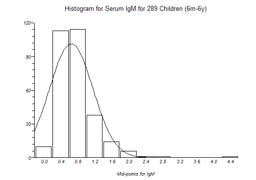
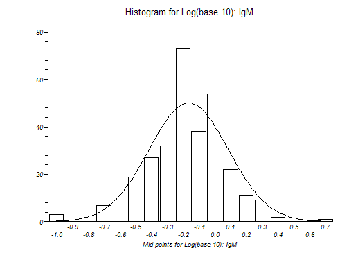
The frequency distribution histogram is plotted vertically as a chart with bars that represent numbers of observations within certain ranges (bins) of values.
The variable that you select is divided into m ranges (bins, bars). The variable is then sorted and the first k values less than or equal to the upper limit of the first bin are counted as the frequency of the first bin. This counting is then repeated for each bin, and bars are plotted to represent the counts. The numbers displayed on the x axis are the middle values (mid-points) for the value range of each bin.
StatsDirect will attempt to select a "neat" number of bins and "neat" mid-point values for your data. You may over-ride this selection and set your own bin specifications when prompted.
You may opt to superimpose a normal/Gaussian curve on a histogram plot.
The text-based version of this plot prints the number of data in each bin.